Why boring typography is dead, and how oversized, experimental type is reshaping everything from branding to social media
By Design Expert • Updated December 2025
Look, I’m going to be honest with you: if your design work isn’t making people stop scrolling, you’re already losing. And nothing—nothing—commands attention quite like hyper-bold expressive typography screaming at you from a landing page at 3 AM.
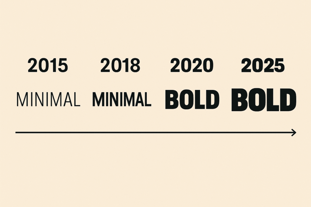
We’re living through a typography revolution. The minimalist whispers of the 2010s? Dead and buried. Today’s designers are wielding fonts like weapons—thick, unapologetic, brutally expressive letterforms that don’t ask for permission. This is maximalist typography on steroids, and it’s everywhere: fashion campaigns, tech startups, music festivals, your favorite creator’s YouTube thumbnail.
If you’ve been playing it safe with neutral typefaces and wondering why your work feels… forgettable, this is your wake-up call. Let me walk you through exactly what hyper-bold expressive typography is, why it matters, and how you can wield it like the design superpower it actually is.
What You’ll Learn
- What makes typography « hyper-bold » and why it’s taking over design
- The psychology behind bold type and emotional impact
- 15 strategic ways to use expressive typography in your projects
- Industry-specific applications and real-world examples
- Top tools and font resources for 2025
1. Understanding Hyper-Bold Expressive Typography: It’s Not Just « Big Fonts »
Here’s where most designers get it wrong: they think hyper-bold expressive typography is just cranking up the font weight to 900 and calling it a day. Wrong. Dead wrong.
Hyper-bold expressive typography is a design philosophy that treats letterforms as primary visual elements—not supporting actors. We’re talking about oversized bold typography that dominates the composition, experimental typography that breaks traditional rules, and expressive font styles that carry as much personality as a brand’s entire color palette.
Key Characteristics of Hyper-Bold Type:
- •Weight: Extra-bold to black font weights (700-900+)
- •Scale: Deliberately oversized, often dominating 40-60% of the viewport
- •Personality: Distinctive character—brush strokes, geometric brutalism, retro curves
- •Impact: Designed to stop scrolls, command attention, create visceral reactions
Think of the difference between a polite handshake and someone grabbing you by the shoulders. Traditional body and display typography? That’s the handshake. Hyper-bold expressive type? That’s the shoulder grab—impossible to ignore, memorable, provocative.
2. Why 2025 Is the Year Bold Typography Went Nuclear
Let me paint you a picture: it’s 2015, and everyone’s obsessing over Helvetica Neue Light at 11pt with generous white space. Clean. Minimal. Safe. Boring as hell.
Fast-forward to today, and the design zeitgeist has completely flipped. The bold typography trends 2025 are all about maximalism, disruption, and emotional immediacy. Why? Three reasons:
Attention Economy
You have 0.3 seconds to stop someone mid-scroll. Whisper-thin type doesn’t cut it anymore. Bold headline fonts and maximalist typography create pattern interrupts that actually work.
Anti-Design Rebellion
Designers are tired of playing nice. The bold anti-design typography trend and brutalist aesthetics are deliberate rejections of corporate polish. It’s raw, it’s honest, it’s human.
Brand Differentiation
When everyone’s using the same Google Fonts, how do you stand out? You go bold. Expressive brush fonts, retro bold display typefaces, and experimental layouts create instant recognition.
3. Master the Psychology: How Font Weight Manipulates Emotion
Here’s something they don’t teach you in design school: typography is emotional manipulation, and font weight is your control dial.
The relationship between font weight, width, and contrast isn’t just aesthetic—it’s psychological. Thick, heavy letterforms trigger different neural responses than delicate ones. Understanding this is the difference between designers who « make things pretty » and those who actually move people.
| Font Weight | Emotional Impact | Best Use Cases |
|---|---|---|
| Light (300-400) | Elegant, sophisticated, delicate | Luxury brands, editorial body text |
| Regular (400-500) | Neutral, trustworthy, professional | Corporate communications, UI text |
| Bold (700) | Confident, assertive, important | Call-to-action buttons, emphasis |
| Extra-Bold (800-900) | Aggressive, powerful, commanding | Headlines, hero sections, posters |
| Black (900+) | Visceral, disruptive, unforgettable | Hyper-bold typography, brand statements |
Pro insight: When you pair extreme weight with condensed width, you create visual tension—urgency, compression, energy. When you pair it with extended width, you get dominance and stability. This is how you engineer feeling.
4. The Strategic Framework: When to Deploy Hyper-Bold vs. Stay Neutral
Not every project deserves hyper-bold treatment. Let me save you from embarrassing yourself.
Knowing when designers should use extremely bold display fonts versus more neutral text faces is about context, audience, and message. Here’s my decision framework:
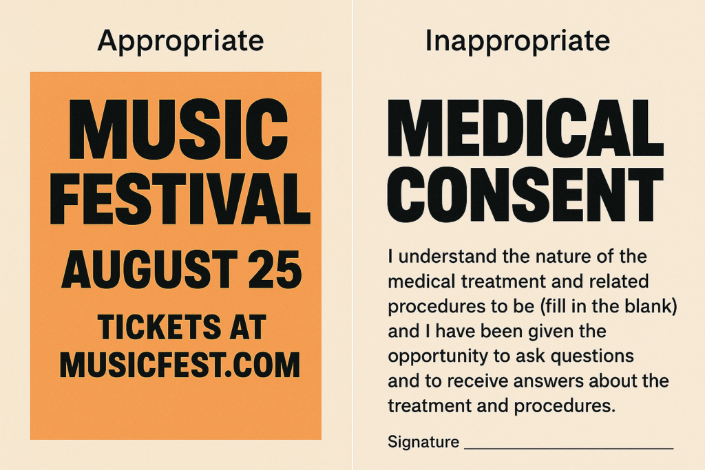
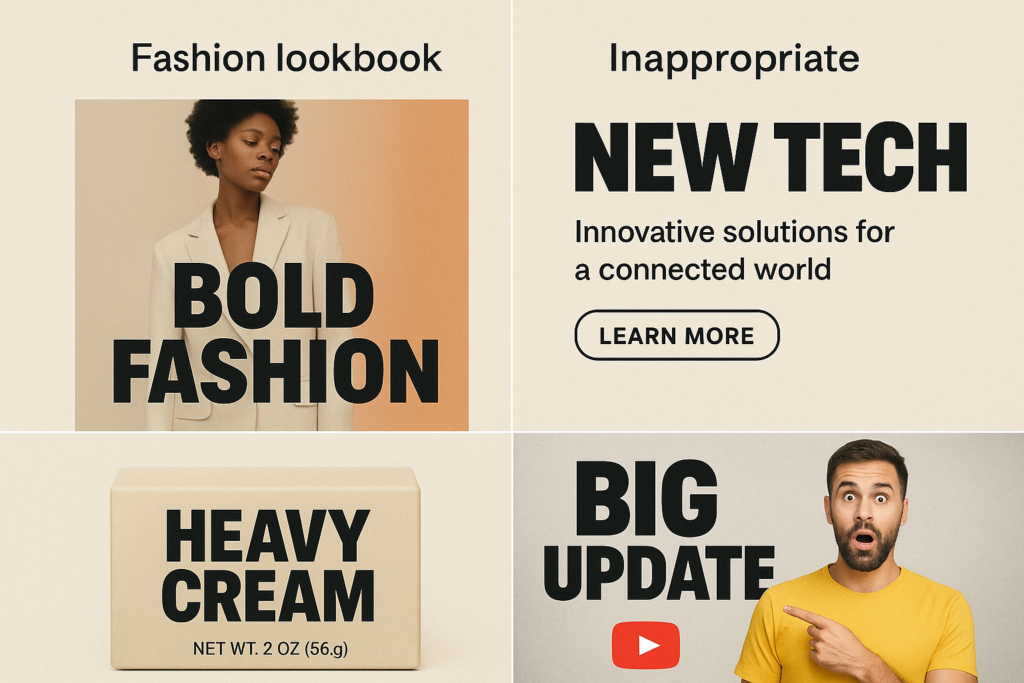
GO HYPER-BOLD WHEN:
- • Your goal is disruption or attention (landing pages, social ads, event posters)
- • Brand personality is loud, confident, or rebellious
- • You’re targeting younger, design-savvy audiences
- • The message is short and punchy (5-10 words max)
- • You need instant differentiation in a crowded market
STAY NEUTRAL WHEN:
- • Readability and accessibility are paramount (long-form content, healthcare, finance)
- • Brand positioning emphasizes trust, stability, or tradition
- • Your audience skews older or more conservative
- • The context is serious or sensitive
- • You’re working within strict brand guidelines
5. Readability Rules: How to Go Big Without Going Unreadable
Here’s the dirty secret about hyper-bold typography: it’s really easy to make it look like absolute garbage.
The key principles for maintaining readability with oversized, expressive type aren’t complicated, but they require discipline. Break these rules and you’ll have something that looks « cool » in your portfolio but bombs in the real world.
The 6 Non-Negotiables:
1. Contrast is King
Dark on light or light on dark. No exceptions. That textured background you love? Kill it. Readability always wins.
2. Limit Line Length
Even with bold type, keep headlines to 40-60 characters per line. Beyond that, the eye loses tracking.
3. Mind Your Spacing
Bold type often needs tighter tracking than you think. Start at -2% and adjust. Too much space kills impact.
4. Strategic Breaking
Break headlines at natural phrase boundaries. Never orphan single words. Your layout should breathe.
5. Size Hierarchy
If everything’s hyper-bold, nothing is. Reserve maximum weight and scale for ONE element per composition.
6. Test at Distance
Zoom out to 25%. If it’s not readable from across the room, it won’t work on a phone at arm’s length.
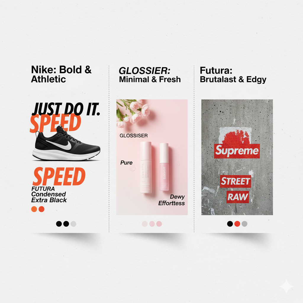
6. Type Pairing Magic: Combining Hyper-Bold with Supporting Fonts
This is where good designers become great ones: understanding how to create a type hierarchy with hyper-bold expressive headings and simpler supporting fonts.
The formula is counterintuitive—the bolder your display font, the quieter your body text should be. Think of it like a band: you can have one virtuoso soloist, but the rest of the ensemble needs to support, not compete.
My Go-To Pairing Strategies:
Strategy 1: Bold + Neutral
Pair expressive brush fonts or retro bold fonts with clean sans-serifs.
Example: Chunko Bold (display) + Inter Regular (body)
Strategy 2: Geometric + Geometric
Use bold brutalist typography with lighter weights from the same family.
Example: Space Grotesk Black (headlines) + Space Grotesk Light (text)
Strategy 3: Contrast Clash
Pair ultra-bold sans with delicate serifs for high-fashion tension.
Example: Druk Wide Black + Garamond Italic
Strategy 4: The Three-Tier System
Display (hyper-bold) + Subheads (medium weight different family) + Body (neutral)
Example: Bebas Neue Bold + Work Sans Medium + System UI Regular
Warning: Never pair two expressive fonts in the same composition. That’s not « experimental »—that’s chaos. Pick your hero and let everything else recede.
7. Industry Applications: Where Hyper-Bold Typography Absolutely Dominates
Not all industries can pull off hyper-bold expressive typography, but the ones that can? They’re running circles around their competition. Here’s where I’ve seen it work best:
Fashion & Lifestyle
Why it works: Fashion thrives on bold statements. Expressive typography for fashion brands signals confidence and trendsetting.
Real-world win: Balenciaga’s website uses brutalist bold type that’s become as recognizable as their logo. That’s brand equity through typography.
Music & Entertainment
Why it works: Festival posters and album covers need to pop in Instagram feeds. Bold experimental typography for social media graphics is non-negotiable.
Real-world win: Coachella’s yearly rebrand uses custom expressive type that trends globally every April.
Tech Startups
Why it works: B2C tech companies use bold display fonts to signal disruption. Think Stripe, Webflow, Notion—all using oversized, confident type.
Real-world win: Figma’s conference branding uses hyper-bold geometric type that photographs well and generates social shares.
Food & Beverage
Why it works: CPG brands competing for shelf space need bold packaging. Retro bold fonts tap nostalgia while standing out.
Real-world win: Liquid Death’s brand uses aggressive bold type that makes water cans look metal. Genius positioning.
Content Creators & Influencers
Why it works: Bold expressive title fonts for YouTube thumbnails increase CTR by 20-40%. This is tested, proven data.
Real-world win: MrBeast’s thumbnail style—hyper-bold yellow type on high-contrast backgrounds—has been studied and copied globally.
8. Essential Tools for Finding and Managing Bold Expressive Fonts
You can’t create great work with mediocre tools. Here are the best platforms and resources I actually use (not sponsored, just honest recommendations):
Adobe Fonts
Integrated with Creative Cloud, massive library of bold display fonts and experimental families. Licensing is handled, syncing is seamless.
Best for: Professional projects where licensing matters
Google Fonts
Free, web-optimized, variable fonts for bold experimental typography for web design. Not as trendy as commercial options, but perfect for quick prototypes.
Best for: Web projects, MVPs, budget-conscious work
Fontfabric
Type foundry publishing bold typography trends reports annually. Great for discovering what’s next.
Best for: Staying ahead of trends, unique commercial fonts
MyFonts
Massive marketplace for retro bold display typefaces, brush fonts, and niche styles. The Amazon of fonts.
Best for: Finding that perfect, specific vibe
Creative Market
Independent designers’ expressive brush fonts and bold brush fonts for logos. More character, less corporate.
Best for: Small business branding, unique personality
Font Management Tools:
- • FontBase (https://fontba.se) – Free, cross-platform manager for organizing massive libraries
- • HyperBold Chrome Extension – Test bold emphasis in real browsing contexts
- • Figma Font Libraries – Share and sync bold expressive typography across team projects
9. Storytelling Through Type: How Bold Fonts Communicate Brand Personality
Every font choice is a brand decision. When you select expressive, brush, or retro-bold fonts to support brand personality, you’re not just « making it look cool »—you’re encoding meaning.
Let me break down the semiotics of bold type styles and what they’re actually communicating to your audience:
| Font Style | Brand Personality | Cultural Association | Ideal For |
|---|---|---|---|
| Bold Geometric Sans | Modern, tech-forward, minimalist | Silicon Valley, Bauhaus, Swiss design | SaaS, fintech, digital products |
| Expressive Brush Fonts | Creative, human, authentic | Hand-crafted movement, street art | Coffee shops, craft brands, indie music |
| Retro Bold | Nostalgic, confident, playful | 70s/80s/90s revival, pop culture | Food & beverage, entertainment, fashion |
| Brutalist/Industrial | Raw, honest, anti-establishment | Punk, underground culture, Eastern European design | Streetwear, music festivals, activism |
| Bold Serif Display | Luxury, editorial, sophisticated | Fashion magazines, high-end retail | Luxury brands, publishing, premium products |
The secret sauce: The most effective brands don’t just pick a bold font—they build an entire storytelling ecosystem around it. The typography becomes shorthand for the brand’s values, instantly recognizable across every touchpoint.
10. Accessibility Isn’t Optional: Making Bold Type Work for Everyone
Look, I know accessibility isn’t the sexiest topic. But if your hyper-bold typography is excluding 15% of your audience, you’re not being edgy—you’re being negligent.
Here’s how to use oversized bold typography for posters, landing pages, and social graphics without sacrificing accessibility:
The Accessibility Checklist:
Contrast Ratio: 4.5:1 Minimum
Use WebAIM’s contrast checker. No exceptions. That trendy low-contrast look? It’s actively harmful to people with low vision.
Alt Text for Type-as-Image
If your bold typography is rendered as an image (Instagram posts, OG images), include descriptive alt text. Screen readers can’t read pixels.
Avoid All-Caps for Long Passages
SCREAMING IN ALL CAPS IS HARD TO READ, especially for people with dyslexia. Use sentence case for anything over 10 words.
Responsive Scaling
Your 120pt hero type needs to scale gracefully to mobile. Test at 320px viewport width minimum.
Color Isn’t the Only Signifier
Don’t rely on color alone to convey meaning. Use weight, size, and position to create hierarchy that works in grayscale.
Test with Real Users
Run your work through actual accessibility testing tools: WAVE, axe DevTools, Lighthouse. Fix what breaks.
Real talk: Accessible design isn’t a constraint—it’s a forcing function for better design. When you design for the edges (low vision, cognitive disabilities, mobile data constraints), you create work that’s stronger for everyone. That’s not compromise. That’s craft.
11. Real-World Case Studies: Bold Typography That Actually Moved Metrics
Theory is cheap. Let me show you campaigns where high-impact typography for advertising delivered measurable business results:
Case Study 1: Spotify Wrapped
Challenge: Make year-end data feel shareable and exciting
Solution: Hyper-bold typography with dynamic color gradients and personalized messaging. Every screen is dominated by oversized type that screams « share me. »
Results: 120M+ social shares annually, becoming a cultural moment that drives Q4 subscriptions. The typography is the product.
Lesson: When your message is personal and time-sensitive, bold expressive typography amplifies emotional connection and virality.
Case Study 2: Duolingo’s Unhinged Rebrand
Challenge: Stand out in crowded edtech space, appeal to Gen Z
Solution: Embraced bold brutalist typography and meme-friendly layouts. Type became aggressive, playful, slightly threatening (matching their mascot’s chaotic energy).
Results: 15M TikTok followers, consistent viral moments, 35% YoY user growth. The brand voice and typography are inseparable.
Lesson: Bold anti-design typography can make boring categories (language learning) feel culturally relevant and meme-worthy.
Case Study 3: Oatly’s Packaging Revolution
Challenge: Make oat milk interesting in a commodity category
Solution: Oversized, irreverent bold typography covering every surface. Long-form copy in massive type that breaks every CPG rule.
Results: $200M+ valuation, cult brand status, spawned countless copycat designs. Packaging became social content.
Lesson: In retail, bold expressive typography on packaging creates stop-power that translates to trial purchases.
12. Trend Forecast: Where Hyper-Bold Typography Is Heading in 2025-2026
I’ve been tracking typography trends for years, and here’s what’s emerging right now in the bold typography trends 2025 landscape:
🔥 Trend 1: Variable Font Exploitation
Designers are finally using variable fonts as intended—creating dynamic, animated weight transitions. Think type that breathes, pulses, and responds to scroll position.
Tools enabling this: Framer, Webflow, custom CSS animations with variable font axes
🔥 Trend 2: Maximum Contrast Layouts
We’re seeing extreme juxtaposition—hyper-bold display type paired with micro-text, creating visual tension. The goal is to make users look twice.
Seen in: Fashion e-commerce, editorial sites, luxury brand campaigns
🔥 Trend 3: Type-as-Texture
Bold typography becoming literal background elements—oversized, cropped, layered. It’s not meant to be read completely; it’s environmental.
Application: Hero sections, immersive landing pages, event branding
🔥 Trend 4: Kinetic Typography 2.0
Motion graphics but make it bold. Every presentation, every video thumbnail, every social post has animated expressive type. Static is dead.
Driven by: After Effects, Motion, Principle, Rive
🔥 Trend 5: AI-Generated Custom Fonts
Tools like Prototypo and Fontjoy are letting designers create custom bold display fonts in minutes. Expect an explosion of bespoke hyper-bold type.
Impact: Democratizes custom typography for small brands and creators
🔥 Trend 6: Sustainability Messaging Through Bold Type
Bold, honest typography paired with environmental claims. The aesthetic is raw, unpolished—communicating transparency and urgency around climate.
Examples: Patagonia’s activism campaigns, B-Corp certification materials
My prediction: By 2026, we’ll see a counter-movement. After years of maximalism, expect a small but influential group to swing back to extreme minimalism—but not the boring kind. Think hyper-bold type with nothing else. Just massive words on empty space. The pendulum always swings.
13. Comparison: Bold Display Fonts vs. Traditional Typography Systems
Let’s settle this once and for all. Here’s a side-by-side comparison of hyper-bold expressive typography versus traditional type systems:
| Criteria | Hyper-Bold Expressive | Traditional Systems |
|---|---|---|
| Primary Goal | Capture attention, create emotional response | Facilitate reading, establish hierarchy |
| Hierarchy Method | Extreme scale + weight contrast | Modular scale, subtle weight variation |
| Best Use Cases | Marketing, branding, social content, event materials | Long-form content, documentation, applications |
| Learning Curve | High—easy to overdo, requires restraint | Medium—established rules and guidelines |
| Accessibility Challenges | Contrast, readability at small sizes, screen reader compatibility | Generally accessible by design |
| Brand Flexibility | Creates strong personality, limits versatility | Neutral, adapts to many contexts |
| Trend Longevity | 2-5 years (trend-dependent) | 10+ years (timeless approach) |
| When to Choose | When differentiation and impact matter more than convention | When trust and longevity matter more than attention |
The truth? You need both. The best design systems I’ve seen use traditional typography for body content and UI, then deploy hyper-bold expressive type strategically for hero sections, CTAs, and brand moments. It’s not either/or—it’s knowing when to scream and when to speak.
14. Your Essential Resource Library: Fonts, Tutorials, and Inspiration
Time to build your toolkit. Here are the best bold fonts for branding and resources I actually use (organized by purpose):
📚 For Learning & Inspiration
- • Fonts In Use – Archive of real-world typography usage with searchable tags for « bold, » « display, » « expressive »
- • Typewolf – Curated showcase of bold typographic layout inspiration from live websites
- • Fontfabric’s Typography Trends Report – Annual deep-dive into what’s emerging in bold and experimental type
- • Material Design 3 Typography Guidelines (https://m3.material.io/styles/typography) – Practical specs for scaling bold type in interfaces
🎨 For Finding Fonts
- • Fontspring (https://www.fontspring.com) – Commercial marketplace, clear licensing for client work
- • Rentafont (https://rentafont.com) – Subscription model with granular weight control (perfect for extrabold/black styles)
- • 1001 Fonts Bold Category (https://www.1001fonts.com/bold+expressive-fonts.html) – Free experimental fonts for testing
- • Creative Market (https://creativemarket.com/fonts) – Independent designers’ bold brush fonts for logos
- • ZarmaType Retro Collection (https://zarmatype.com/retro-bold-font) – Focused collection of retro bold display typefaces
🛠️ For Production
- • Figma (https://www.figma.com) – Test bold experimental typography for web design with live prototypes
- • Procreate (https://procreate.com) – iPad app for hand-lettering and custom expressive brush fonts
- • Affinity Designer (https://affinity.serif.com/designer) – Vector tool for oversized type compositions
- • FontBase (https://fontba.se) – Organize your growing bold font library across projects
⚡ Quick-Start Platforms
- • Canva Pro (https://www.canva.com) – Templates with bold expressive title fonts for YouTube thumbnails
- • Envato Elements (https://elements.envato.com/fonts) – Unlimited downloads for experimentation
- • Adobe Fonts (https://fonts.adobe.com) – Integrated with CC, sync directly to design apps
Pro tip for students and beginners:
Start with Google Fonts (free, web-safe) and Fontspace (free personal use). Build foundational skills before investing in premium fonts. Once you understand maximalist bold font combinations, then upgrade to commercial licenses for client work.
15. Taking Action: Your Next Steps with Hyper-Bold Typography
Alright, we’ve covered a lot. Now here’s what you actually need to do with all this information:
The 30-Day Bold Typography Challenge
Week 1: Audit & Research
Review your last 10 projects. Where could bold type have created more impact? Screenshot 50 examples of hyper-bold typography you love. Identify patterns.
Week 2: Experiment
Take one current project and create three versions: (1) your default approach, (2) with bold display fonts for headlines, (3) full hyper-bold treatment. Compare honestly.
Week 3: Build Your Library
Download 10-15 bold expressive fonts across different styles (geometric, brush, retro, brutalist). Organize them in FontBase. Create a reference sheet.
Week 4: Ship Something
Create one piece using hyper-bold expressive typography and actually publish it. Instagram post, landing page mockup, personal project—doesn’t matter. Just ship it.
If You’re a Designer
- • Add 3-5 bold expressive fonts to your go-to toolkit
- • Practice type pairing exercises weekly
- • Study how brands you admire use bold typography
- • Experiment with accessibility testing tools
- • Share your work and iterate based on feedback
If You’re a Marketer/Creator
- • Test bold typography in your next campaign
- • A/B test thumbnail designs with hyper-bold type
- • Build a swipe file of effective bold designs
- • Collaborate with designers who understand this aesthetic
- • Track engagement metrics before/after bold type adoption
Look, typography isn’t magic. But hyper-bold expressive typography is the closest thing we’ve got to a design superpower in 2025. It’s loud, it’s confident, it demands attention—and when done right, it transforms forgettable work into unforgettable experiences.
The designers winning right now? They’re not playing it safe. They’re using bold experimental typography to cut through noise, build brands with personality, and create work that makes people stop scrolling and actually feel something.
Ready to Go Bold?
You’ve got the knowledge. You’ve got the tools. Now you just need to actually use them.
Here’s my challenge to you: take one project this week—doesn’t matter if it’s a client deliverable, a portfolio piece, or just a personal experiment—and push yourself to go bolder than you’re comfortable with. Use oversized bold typography, pair it confidently, break some rules.
The worst thing that can happen? You learn something. The best thing? You create work that actually gets noticed.
What to do next:
- Bookmark this guide and reference it during your next project
- Start building your bold font library using the resources listed above
- Join design communities (Behance, Dribbble, Twitter/X) and share your bold type experiments
- Study the case studies mentioned and analyze why they worked
The future of design is bold. Don’t get left behind speaking in whispers.
Found this guide helpful? Share it with your design team and let’s normalize bold, confident typography in 2025.
#HyperBoldTypography#BoldDisplayFonts#TypographyTrends2025#ExpressiveType