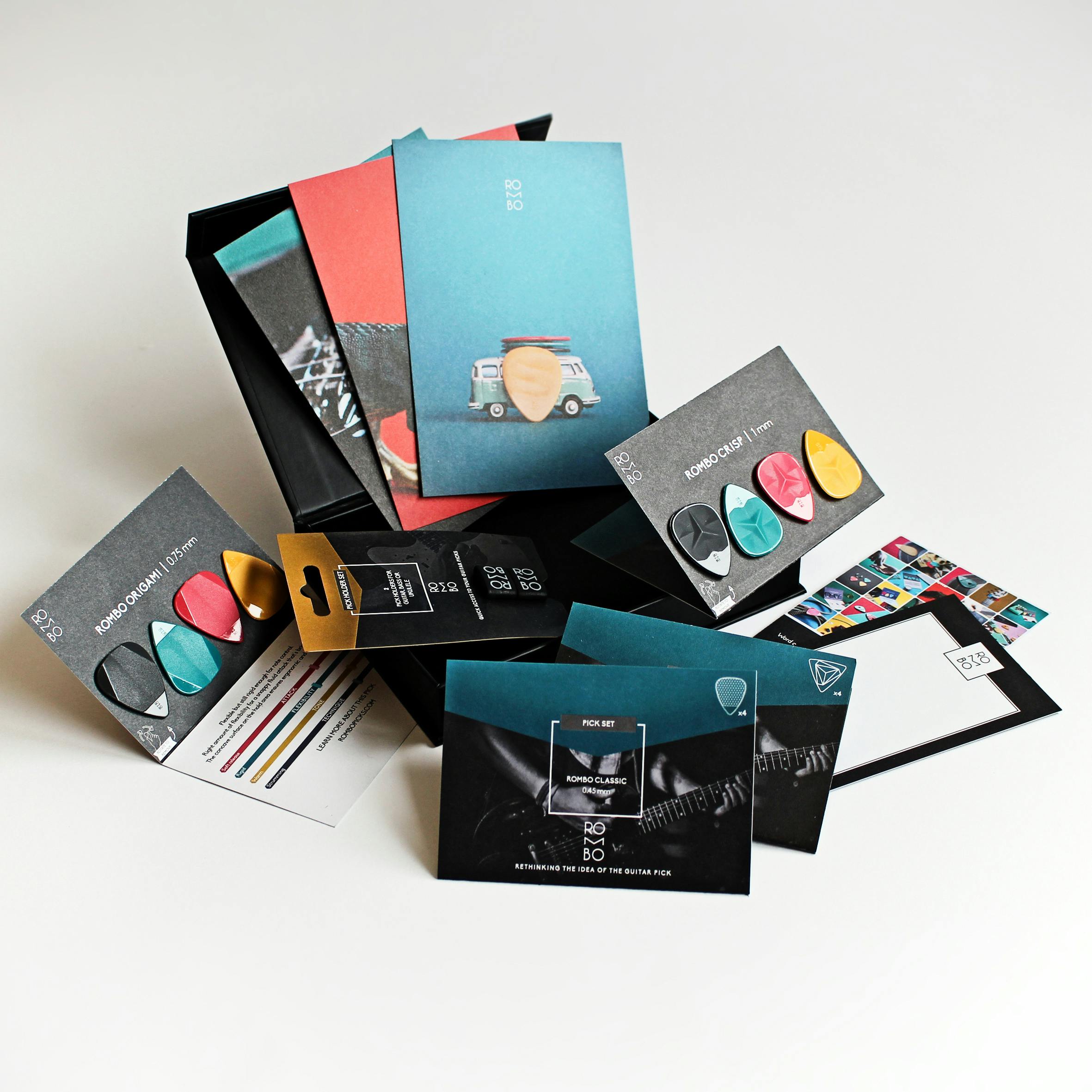
The choice of colors is much more than just an aesthetic decision. When used intelligently, color psychology helps convey emotions, influence purchasing behavior, and strengthen brand identity. In this article, we explore the impact of each color and how to strategically integrate it into brand design.
1. Why is Color Essential in Branding?
Colors unconsciously influence customers' feelings and attitudes toward a brand. For example, a warm color like red grabs attention, while a soothing blue inspires trust. By selecting the right colors, you can reflect the essence of your brand and strengthen customers' emotional attachment.
2. The Meanings of Colors in Brand Design
- Red : Associated with energy, passion, and urgency. Red is perfect for dynamic brands or promotional offers, as it quickly grabs attention.
- Blue: A symbol of trust and serenity, blue is often used by companies in the financial services, healthcare, and technology sectors.
- Green: Representing nature and growth, green is suitable for eco-friendly brands or wellness businesses.
- Yellow: This color inspires optimism and energy, making it ideal for joyful or innovative brands.
- Black :Synonym of sophistication and elegance, often used in the luxury and fashion industries.
- White: Associated with simplicity and purity, white is particularly effective in conveying a clean and modern design.
3. Harmonize Colors to Strengthen Brand Consistency
The use of multiple colors must be harmonious and aligned with the message you wish to convey. It is recommended to choose a palette of 2 to 3 main colors and develop them to create a cohesive visual universe.
4. Examples of Brands Getting Their Color Palette Right
Apple, for example, uses neutral tones to suggest a sleek and timeless design. Coca-Cola, with its iconic red, evokes passion and energy, while Starbucks uses green to reinforce its commitment to eco-friendliness and nature.
5. How to Choose Colors for Your Brand?
Start by analyzing your target audience and your company's values. The colors you choose should resonate with your customers while reflecting your values. Test different combinations to see which ones capture attention while remaining consistent with your message.
Conclusion: By mastering the psychology of colors, you transform your logo and visual identity into a powerful communication tool. The right colors will attract, inspire, and retain your customers. So, don't hesitate to explore color palettes and experiment until you find one that truly represents you!
Here are some external resources.
- Shutterstock – The Psychology of Colors in Marketing
- Oscar Black – Psychology of Colors: Meanings and Influences in Design
- Adobe – Color Theory: Psychology of Color
- Ruben Stom Design – How Color Affects Design
These articles offer valuable advice and detailed steps to understand and use color psychology in your design projects. 😊


