The Anti-Perfect Revolution
Why Your Designs Should Look a Little… Broken
Let me tell you something weird that’s happening in design right now. We spent decades perfecting our craft—aligning pixels, smoothing curves, making everything just right. And now? We’re deliberately messing it all up.
I’m not talking about being lazy or sloppy. I’m talking about imperfect design—the intentional embrace of flaws, asymmetry, and that beautiful messiness that screams « a human made this. » And honestly? It’s the most exciting thing to happen to visual design in years.
Picture this: You’re scrolling through Instagram, and everything looks so… perfect. AI-generated gradients, flawless compositions, those eerily smooth illustrations that all seem to come from the same algorithmic brain. Then suddenly—bam—you see something with wobbly lines, grainy textures, letters that don’t quite line up. You stop scrolling. That’s the power of humanized design.
Quick Take: What We’re Covering
- ▸Why audiences are craving « broken » aesthetics in 2026
- ▸How wabi-sabi philosophy is reshaping modern branding
- ▸20 tools that help you create authentic imperfections
- ▸Practical techniques for balancing chaos with professionalism
1. Decoding the Imperfect Design Movement
So what exactly is imperfect design? Think of it as the visual equivalent of showing up to a fancy dinner party in your favorite worn-in jeans instead of a stiff suit. It’s choosing authenticity over polish.
The Core Philosophy: Raw Over Refined
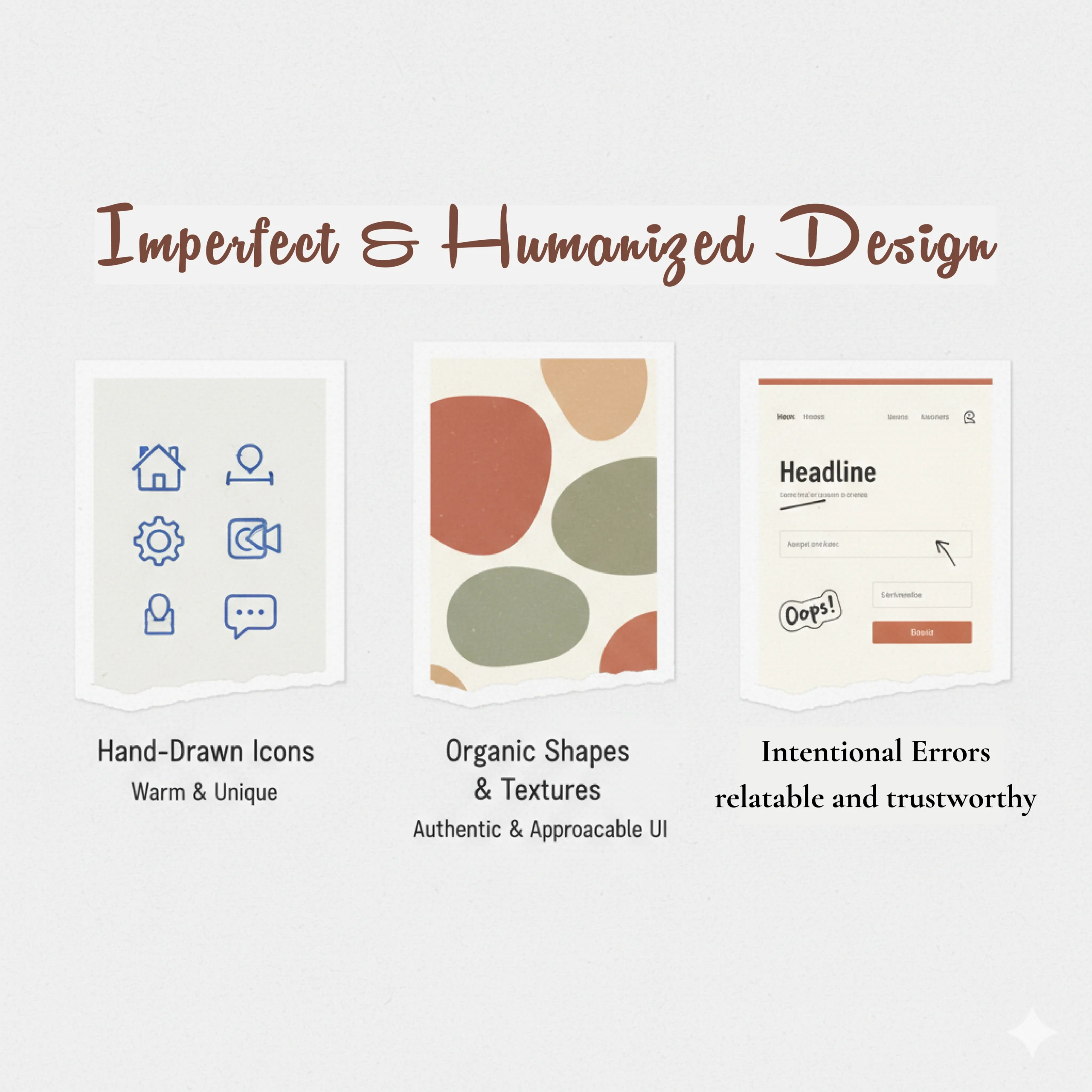
Imperfect design prioritizes raw, flawed aesthetics—think asymmetry, hand-drawn elements, visible textures—over sterile perfection. It’s about creating work that feels lived-in rather than manufactured. Where traditional design says « make it seamless, » imperfect design says « let the seams show. »
How Imperfect Design Differs from Pixel-Perfect Aesthetics:
| Traditional Design | Imperfect Design |
|---|---|
| Perfect alignment | Intentional asymmetry |
| Smooth gradients | Grainy overlays |
| Geometric precision | Organic spacing |
| Vector sharpness | Sketchy borders |
| Sans-serif uniformity | Hand-drawn typography |
Wabi-Sabi: The Japanese Secret Sauce
Here’s where things get philosophical. Wabi-sabi—a Japanese aesthetic celebrating transience and imperfection—is basically the spiritual godfather of this whole movement. It says: beauty exists in the incomplete, the impermanent, the imperfect.
In practical design terms? Wabi-sabi inspires us to embrace organic textures, asymmetrical layouts, and that sense of something being beautifully unfinished. It’s why a cracked ceramic bowl can feel more precious than a factory-perfect one. That crack tells a story.
« The essence of wabi-sabi design is to accept the natural cycle of growth and decay. Your designs don’t need to be immortal—they need to feel alive. »
2. Why Human Imperfection Is THE Design Trend of 2026
Okay, so why is this happening now? Why are we suddenly obsessed with making things look handmade when we have tools that can generate perfect compositions in seconds?
The AI Fatigue Factor
Let’s be real: audiences are drowning in AI-generated content. Midjourney, DALL-E, Stable Diffusion—these tools are incredible, but they’ve also created a visual homogeneity problem. Everything starts to look the same. That ultra-smooth, too-perfect aesthetic that screams « a robot made this. »
People crave emotional resonance now more than ever. When you see a design with visible brush strokes, uneven kerning, or that slight wobble in the lines, your brain immediately registers: « A human spent time on this. Someone cared. » That’s the anti-AI design movement in action—it’s not anti-technology, it’s pro-humanity.
Fun Fact:
Studies show that unique, non-generic visuals can actually improve your SEO. Search engines are getting smarter at identifying authentic, original content versus mass-produced AI imagery. Your imperfect designs might literally help you rank better.
Building Trust Through Vulnerability
Here’s something I’ve noticed working with brands: the more « perfect » your visual identity, the more corporate and distant you feel. But add some handmade aesthetics—maybe a logo with slightly irregular letterforms, packaging with visible paper textures—and suddenly you’re approachable. Trustworthy. Real.
Brands adopt imperfect aesthetics because they understand this psychology. They’re using candid imagery instead of stock photos, hand-drawn elements instead of clipart, and authentic branding that says « we’re humans talking to humans. » In a world where everyone’s trying to look like a Silicon Valley unicorn, showing your rough edges is actually the most sophisticated move you can make.
3. 20 Essential Tools for Creating Beautiful Imperfections
Can AI tools create humanized imperfect designs? Absolutely. The irony isn’t lost on me—we’re using sophisticated technology to simulate hand-drawn imperfection. But here’s the thing: it works. Tools like Midjourney can simulate watercolor bleeds and rough pencil strokes that would take hours to create traditionally.
Digital Painting Tools
1. Procreate
Natural brush strokes and organic textures for iPad artists.
2. Adobe Fresco
Live brushes that simulate real paint bleeding into paper.
3. Krita
Free software with advanced brushes for sketchy digital art.
AI Generation
4. Midjourney
AI excelling in painterly, watercolor aesthetics.
5. Illustration.app
Consistent handmade style with randomness controls.
Vector & UI Design
6. Figma
Perfect for intentional asymmetry and handcrafted UI.
7. Astute Graphics
Illustrator plugins for organic path distortions.
Typography
8. Handdrawn Letters
Irregular script fonts evoking personal handwriting.
9. Wabi Sabi Font
Asymmetrical type inspired by Japanese philosophy.
10. RoughScript Family
Variable font with natural stroke variations.
11. Expressive Fonts Pack
Collection of fluid, imperfect letterforms.
Textures & Effects
12. Roughen Edges Brushes
Procreate pack adding grain and distress.
13. Texture Haven
Free PBR textures for paper grain and rough surfaces.
14. Grunge Textures Pack
Overlays for distressed, lived-in design elements.
15. PaperTexturizer Plugin
Adds realistic paper flaws to vectors.
16. Distressed Designer Bundle
Fonts and overlays for raw branding aesthetics.
3D Sculpting
17. ZBrush
Industry standard for hyper-real organic flaws.
18. Nomad Sculpt
Mobile 3D tool for intuitive imperfect sculpting.
Quick Solutions
19. Canva Magic Studio
Template customizer for quick handmade graphics.
20. Hand Drawn Mockups
Templates showing imperfect prints on crumpled paper.
4. How to Add Human Touches Without Looking Sloppy
Is imperfect design suitable for professional branding? Absolutely—but there’s an art to it. The key is making flaws feel intentional, not accidental.
Practical Techniques
1Grainy Overlays
Add subtle grain texture at 5-15% opacity for tactile feel.
2Irregular Typography
Create hierarchy through intentional misalignment while keeping body text readable.
3Organic Spacing
Break the grid occasionally to create visual tension and keep eyes moving.
Warning Signs You’ve Gone Too Far:
- ✗ Text becomes genuinely hard to read
- ✗ Navigation gets confusing
- ✗ Imperfections feel random rather than strategic
- ✗ Users describe work as « messy » instead of « authentic »
5. The Future of Humanized Design
What’s the future of humanized design post-2026? Expect tools with « imperfection sliders » for controlled chaos in workflows. We’ll see this aesthetic mature beyond trendy into sophisticated authenticity.
The Big Takeaway
Imperfect design isn’t about abandoning craft—it’s about elevating it. In a world dominated by algorithmic perfection, the wobbles and grains become the most valuable pixels on screen.
Your designs don’t need to be flawless. They need to feel real.
Frequently Asked Questions
Can I use imperfect design for corporate work?
Yes, but dose carefully. Even conservative industries can benefit from subtle humanizing touches while maintaining functionality.How do I know if imperfections look intentional?
Ask: does this serve the design? Intentional imperfection has rhythm and purpose. Get peer feedback to ensure it reads as authentic, not sloppy.Do imperfect designs perform better in marketing?
For the right audience, yes. Authentic visuals get more engagement and can improve SEO by standing out from AI-generated content.
Written for designers who aren’t afraid to show their human side
Keywords: Imperfect design, humanized design, wabi-sabi design, hand-drawn typography trends, anti-AI design, organic imperfection, authentic branding