Look, I’ll be honest with you—building a visual brand in 2025 isn’t just about slapping a logo on your business card and calling it a day. It’s about crafting an identity so distinctive that people recognize you from across a crowded digital landscape. Think about it: Can you spot an Apple product from fifty feet away? Could you identify a Coca-Cola ad with your eyes half-closed? That’s the power of visual brand identity design, and frankly, you need it too.
Whether you’re launching a scrappy startup from your garage or revamping a corporate visual identity that’s been gathering dust since 2010, understanding visual branding is no longer optional—it’s survival. I’ve watched countless businesses pour money into products and services while their brand visual communication screams « amateur hour. » Don’t be that person.
This isn’t your typical boring branding lecture. We’re diving deep into the real, actionable strategies that separate forgettable brands from the ones that make you stop scrolling. Ready? Let’s get into it.
1. Understanding What a Visual Brand Actually Means (And Why You’re Probably Getting It Wrong)
Here’s the thing most people miss: a visual brand isn’t just your logo. It’s the entire visual vocabulary your business uses to communicate who you are, what you stand for, and why anyone should care.
Your visual brand encompasses everything from your logo design and color palette to your typography, imagery style, and even how you arrange elements on a page. It’s the visual storytelling that happens before anyone reads a single word of your copy.
Think of it as your business’s wardrobe. You wouldn’t wear a tuxedo to a beach party or flip-flops to a board meeting, right? Your visual brand identity works the same way—it needs to match the occasion, the audience, and the message you’re trying to convey.
The components that make up a killer visual brand:
- Logo and brand mark variations
- Color palette (primary and secondary)
- Typography system (headlines, body text, accents)
- Imagery and photography style
- Graphic elements and patterns
- Layout and composition principles
- Brand voice reflected visually
2. Why Visual Branding Matters More Than Your Marketing Budget
Let me paint you a picture. You’ve got two coffee shops next to each other. One has a cohesive brand visual identity—warm earth tones, artisanal photography, clean typography. The other? A mishmash of fonts, clipart from 2003, and colors that make your eyes water.
Which one are you choosing? Exactly.
Visual branding influences customer perception and loyalty in ways that run deeper than conscious thought. Research consistently shows that people make snap judgments about brands within milliseconds—and 90% of that judgment is based on color alone.
But here’s what really matters: consistent visual brand presentation increases revenue by up to 23%. That’s not chump change. That’s the difference between struggling and thriving.
A strong brand identity design:
- Builds instant recognition and recall
- Establishes credibility and professionalism
- Differentiates you from competitors
- Creates emotional connections with audiences
- Increases perceived value of your offerings
- Supports premium pricing strategies
- Enhances customer loyalty and advocacy
3. The Color Psychology Game: Choosing Your Brand Color Palette Like a Pro
Colors aren’t just pretty—they’re psychological weapons. The role colors play in visual branding goes way beyond aesthetics. We’re talking about tapping into deep-rooted emotional responses that influence behavior.
Blue screams trust and reliability (hello, banks and tech companies). Red pumps adrenaline and urgency (fast food chains, anyone?). Green whispers growth, health, and environmental consciousness. Black exudes luxury and sophistication.
Strategic color selection framework:
| Color | Psychological Association | Best For |
|---|---|---|
| Blue | Trust, stability, calm | Financial services, healthcare, technology |
| Red | Energy, passion, urgency | Food, entertainment, sales-driven brands |
| Green | Growth, health, nature | Wellness, sustainability, organic products |
| Yellow | Optimism, creativity, warmth | Children’s products, creative services, hospitality |
| Purple | Luxury, wisdom, creativity | Beauty, premium brands, innovative tech |
| Orange | Friendly, confident, energetic | Youth brands, sports, telecommunications |
| Black | Sophisticated, powerful, elegant | Luxury goods, high-end services, fashion |
| White | Clean, simple, modern | Tech, healthcare, minimalist brands |
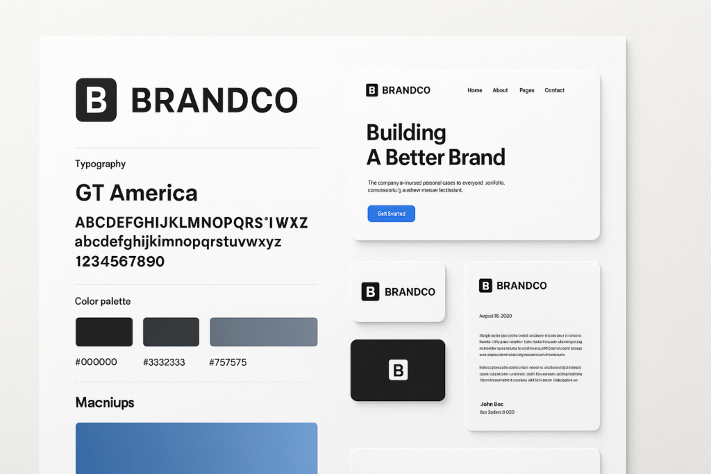
But here’s the clever bit: you’re not choosing one color. You’re building a brand color palette—typically a primary color, 2-3 secondary colors, and neutral tones. This system needs to work across everything from your website to your business cards to your Instagram stories.
Pro tip: Test your colors for accessibility. Your stunning color combo means nothing if people with color blindness can’t distinguish your call-to-action buttons.
[Insert image of effective brand color palette with primary, secondary, and neutral tones clearly labeled]
4. Logo Design: The Face of Your Brand Visual Communication
Your logo is the handshake, the first impression, the thing people will associate with every experience they have with your brand. No pressure, right?
A logo impacts your visual brand by serving as the anchor point for everything else. It’s the most distilled version of your brand identity—the visual shorthand that appears everywhere.
What makes a logo actually work:
- Simplicity: Think Nike swoosh, not a Renaissance painting
- Memorability: Can someone sketch it from memory after seeing it twice?
- Versatility: Does it work in black and white? At thumbnail size? On a billboard?
- Relevance: Does it make sense for your industry and audience?
- Timelessness: Will it still look good in ten years?
I’ve seen too many businesses fall in love with trendy logo styles that age like milk. Your cousin’s boyfriend who « does graphic design » might create something that looks cool today, but brand logo design is an investment, not an expense.
Logo types to consider:
- Wordmark: Text-only (think Google, Coca-Cola)
- Lettermark: Initials (IBM, HBO, CNN)
- Icon/Symbol: Visual mark without text (Apple, Twitter bird)
- Combination mark: Icon + text together (Adidas, Doritos)
- Emblem: Text inside a symbol (Starbucks, Harley-Davidson)
5. Typography: The Silent Voice of Your Visual Brand Strategy
Brand typography is where things get sneaky. Most people don’t consciously notice fonts, but they absolutely feel them. Serif fonts whisper tradition and authority. Sans-serif fonts shout modernity and clarity. Script fonts flutter with elegance or playfulness depending on the style.
Your typographic system needs at least two fonts—one for headlines, one for body text. Sometimes a third accent font for special emphasis. But here’s the rule: never more than three. Any more and you’re running a font circus, not a brand.
Typography selection checklist:
- Readability at various sizes
- Legibility across devices and print
- Personality alignment with brand values
- Language support for international audiences
- Web font availability and load times
- Licensing for commercial use
6. Creating Your Brand Style Guide: The Bible of Visual Brand Consistency
A brand style guide (or visual brand guideline) is your insurance policy against visual chaos. It’s the document that ensures your brand looks like the same brand whether someone encounters you on Instagram, your website, or a trade show banner.
Essential elements of a comprehensive brand style guide:
- Logo usage: Primary versions, minimum sizes, clear space requirements, what NOT to do
- Color specifications: Hex codes, RGB, CMYK, Pantone values
- Typography rules: Font families, sizes, line spacing, hierarchies
- Imagery guidelines: Photography style, illustration approach, image treatments
- Graphic elements: Patterns, icons, shapes, textures
- Layout principles: Grid systems, spacing, alignment
- Voice and tone: How visual style reflects brand personality
- Application examples: Business cards, social media, packaging, etc.
Think of your brand identity guidelines as the difference between a professional orchestra and a bunch of talented musicians playing whatever they feel like. Both have skill, but only one creates harmony.
Pro move: Make your brand style guide accessible to everyone who touches your brand—designers, marketers, partners, vendors. Cloud-based tools like Brandfolder or Brandworkz make this effortless.
7. Visual Brand Storytelling: Making People Feel Something
Here’s where we separate the amateurs from the artists. Visual brand storytelling transforms static design elements into narratives that resonate emotionally.
Every visual choice tells a story. Sharp angles and bold colors tell a different story than soft curves and pastels. Gritty urban photography tells a different story than minimalist product shots on white backgrounds.
Storytelling through visual brand elements:
- Imagery style: What world are you inviting people into?
- Compositional choices: Dynamic and energetic vs. calm and balanced?
- Visual metaphors: What deeper meanings can your visuals suggest?
- Cultural references: What aesthetic traditions are you tapping into?
- Emotional tone: Aspirational? Relatable? Authoritative? Playful?
I remember working with a sustainable fashion brand that struggled with their visual identity. Once we shifted from sterile product photography to showing their pieces in real environments—worn by real people doing real things—their engagement exploded. That’s visual storytelling at work.
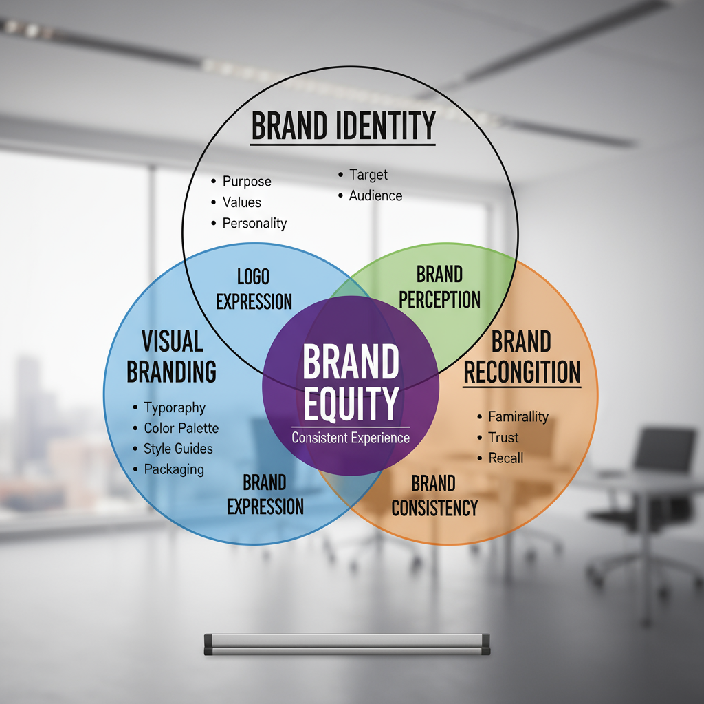
8. The Difference Between Brand Identity and Visual Branding (Yes, They’re Different)
People use these terms interchangeably, but they’re not the same thing, and understanding the distinction will level up your entire approach.
Brand identity is the complete package—your mission, values, voice, personality, positioning, and yes, visual elements. It’s everything that makes you you.
Visual branding is specifically the visual component of that identity—the look and feel that represents all those intangible qualities.
Think of it this way: brand identity is your personality, values, and character. Visual branding is how you dress, how you style your hair, and how you present yourself to the world. Both matter. Both need to align.
9. Visual Identity System: Building Your Brand’s Visual Architecture
A visual identity system is like the architectural blueprint for your brand’s appearance. It’s more structured than just having a logo and some colors—it’s a cohesive framework that governs every visual decision.
Components of a robust visual identity system:
- Primary design elements: Core building blocks used consistently
- Secondary elements: Supporting visuals for variety
- Spacing and proportion rules: Mathematical relationships between elements
- Animation and motion principles: How things move in digital spaces
- Responsive design considerations: How identity adapts across contexts
- Accessibility standards: Ensuring inclusivity in all visual communications
Companies like Adobe Creative Cloud and Figma have revolutionized how teams build and maintain these systems collaboratively. No more emailing version_final_FINAL_v3.png back and forth like it’s 2010.
10. Conducting a Visual Brand Audit: Finding Your Weak Spots
Even established brands need regular check-ups. A visual brand audit examines every touchpoint where your brand appears and asks the tough questions: Is this consistent? Is this working? Is this still relevant?
Your visual brand audit checklist:
- Logo usage across all platforms (correct? consistent?)
- Color application (on-brand everywhere?)
- Typography implementation (following guidelines?)
- Imagery style (cohesive visual language?)
- Social media presence (recognizable as same brand?)
- Website and digital properties (unified experience?)
- Print materials (matching digital presence?)
- Packaging and product design (aligned with brand?)
- Physical spaces (if applicable—retail, offices, events)
Schedule these audits annually, or whenever you feel like something’s « off. » Sometimes you’re too close to see the issues. Consider bringing in a professional or using tools like Canva or Sketch to create side-by-side comparisons.
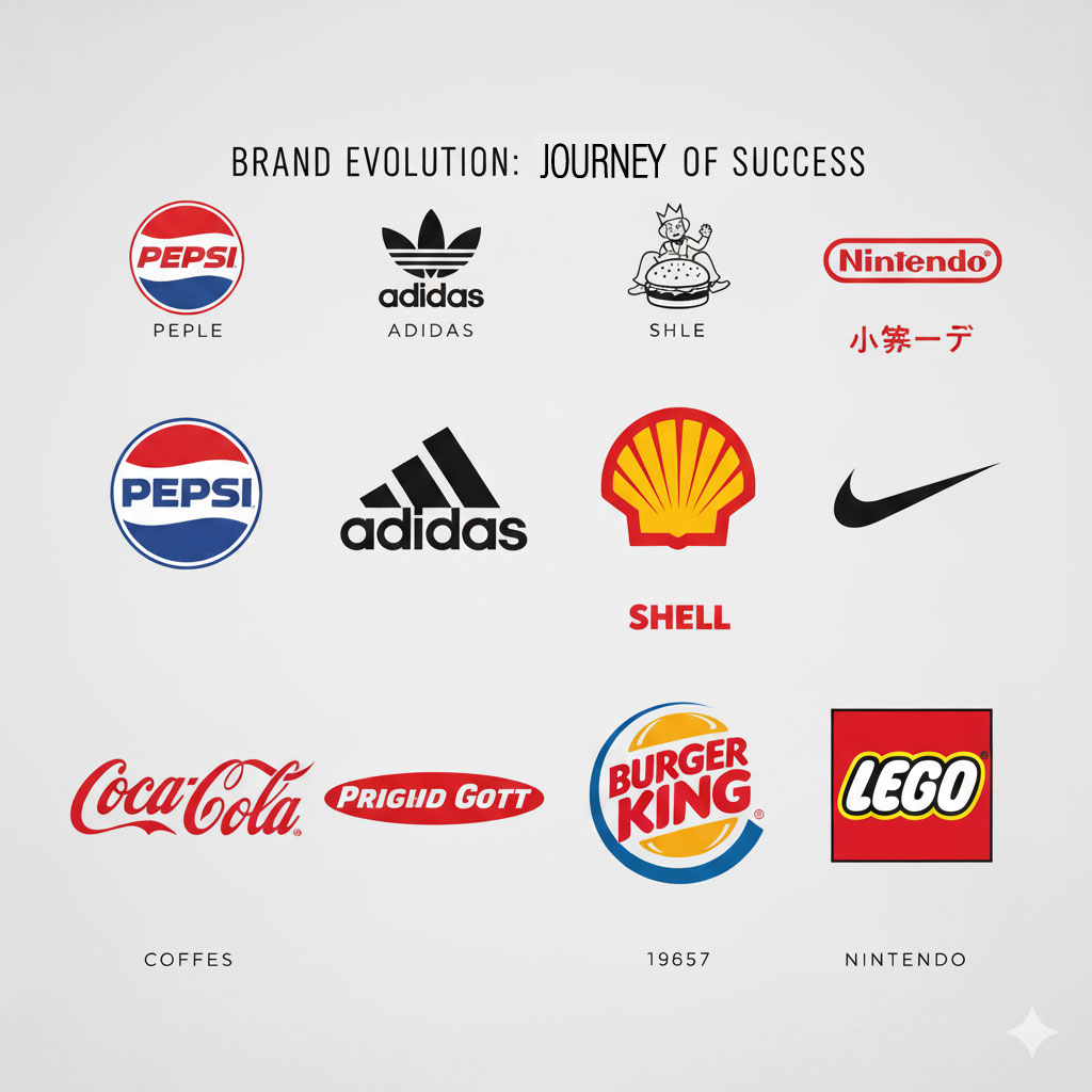
11. When and How to Update Your Visual Brand (Without Losing Your Identity)
So how often should you update your visual brand? The answer isn’t a number—it’s a feeling.
Update when:
- Your visual identity feels dated and is turning off your target audience
- Your business has evolved significantly from when you created your original brand
- You’re expanding into new markets or demographics
- Your competitors have all modernized while you haven’t
- Your current identity doesn’t work well in digital spaces
- You’re getting confused with other brands
But here’s the crucial part: brand logo refresh and identity updates exist on a spectrum.
The three levels of brand updates:
- Refinement: Subtle tweaks that modernize without dramatically changing (think Pepsi’s multiple evolutions)
- Evolution: More significant changes while maintaining core recognizable elements (Instagram’s shift from detailed icon to gradient)
- Revolution: Complete overhaul for businesses pivoting dramatically (Philip Morris becoming Altria)
Most of the time, you want refinement or evolution. Revolution is risky and expensive—you’re essentially starting over.
12. Top Tools for Visual Brand Designer Success
Let’s talk tools. You can have all the strategy in the world, but you need the right software to execute your brand identity design vision.
Professional-grade design suites:
- Adobe Creative Cloud: The industry standard. Photoshop, Illustrator, InDesign—if you’re serious about branding graphic design, this is your arsenal. Yes, it’s a subscription. Yes, it’s worth it.
- Figma: Revolutionizing collaborative design. Multiple team members working on the same file simultaneously? Game-changer for brand identity package development.
- Sketch: Still beloved by UI/UX designers for its vector-based approach and plugin ecosystem.
Accessible tools for smaller teams:
- Canva: Don’t let the pros sneer at this one. Canva has evolved into a legitimate brand identity design template powerhouse. Perfect for small business owners who need professional results without the learning curve.
- Looka: AI-powered logo creation that’s actually good. Input your preferences, get dozens of professional options, customize, and walk away with a complete brand identity kit.
- VistaCreate (formerly Crello): Similar to Canva but with some unique templates and features worth exploring.
Brand management platforms:
- Brandfolder: Digital asset management focused on maintaining brand visual identity consistency across teams and partners.
- Brandworkz: Enterprise-level brand management for organizations that need serious control over their visual assets.
Quick creation tools:
- Placeit: Need mockups yesterday? This brand visual identity kit generator creates professional product mockups, apparel designs, and marketing visuals fast.
- Snappa: Streamlined tool specifically for visual brand marketing assets like social media graphics and ads.
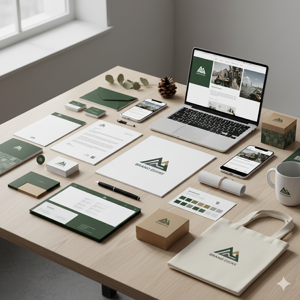
13. Building Your Brand Identity Package: The Complete Deliverables List
When you invest in professional visual brand development (or DIY it properly), you should end up with a comprehensive brand identity package. Here’s what should be included:
Core identity elements:
- Primary logo (full color)
- Secondary logo variations (stacked, horizontal, icon-only)
- Logo inversions (light backgrounds, dark backgrounds)
- Minimum size specifications
- Clear space guidelines
Color system:
- Primary color palette with all color codes
- Secondary/accent colors
- Neutral tones
- Color combination examples
Typography package:
- Font files (with proper licensing)
- Type scale and hierarchy examples
- Font pairing demonstrations
Visual elements:
- Iconography set (if applicable)
- Patterns or textures
- Graphic elements library
- Photography or illustration style guide
Application mockups:
- Business card design
- Letterhead and envelope
- Email signature
- Social media profile templates
- Presentation deck template
Documentation:
- Complete brand style guide (PDF)
- Brand messaging and positioning brief
- Implementation guidelines
Think of this as your brand visual identity kit—everything you need to present your brand professionally across every channel.
14. Visual Brand Marketing: Making Your Identity Work Across Channels
You’ve got this killer visual brand. Now what? Visual brand marketing is about strategically deploying your identity to maximum effect across every customer touchpoint.
Channel-specific considerations:
Social Media:
- Platform-specific dimensions and safe zones
- Consistent visual treatment across platforms while respecting each platform’s culture
- Branded templates for various content types (quotes, announcements, behind-the-scenes)
Website:
- Landing page visual hierarchy reflecting brand priorities
- Consistent component library (buttons, forms, cards)
- Brand-aligned photography and imagery throughout
Email Marketing:
- Branded header templates
- Consistent color blocking and typography
- Signature style that reinforces visual brand
Paid Advertising:
- Ad creative that’s immediately recognizable as your brand
- Consistent visual language across platforms (Google, Facebook, LinkedIn, etc.)
- A/B testing within brand guidelines to optimize performance
Print and Physical:
- Packaging that extends your digital visual identity
- Trade show materials that command attention while staying on-brand
- Promotional items that people actually want to keep
The key? Consistency with flexibility. Your core visual elements stay constant, but the application adapts to context and platform requirements.
15. Hiring a Visual Brand Designer vs. DIY: Making the Right Choice
Final real talk: should you hire a professional or do this yourself?
Go DIY if:
- You’re bootstrapping with a tiny budget
- You have design skills or experience
- Your business is in early experimental stages
- You’re using quality tools like Canva, Looka, or Adobe Spark
- You have time to learn and iterate
Hire a pro if:
- You have budget to invest properly ($2,000-$50,000+ depending on scope)
- Visual branding is critical to your business success
- You’re launching or rebranding a serious operation
- You lack design skills and instincts
- You want to get it right the first time
Where to find visual brand designers:
- 99designs: Competitive platform where multiple designers pitch concepts
- Fiverr/Upwork: Freelance marketplaces (quality varies—vet carefully)
- Dribbble/Behance: Portfolio sites where you can find and reach out to talented designers directly
- Local agencies: For bigger projects requiring strategy, research, and comprehensive brand development
Questions to ask potential designers:
- Can I see relevant work samples for businesses similar to mine?
- What’s your process from initial consultation to final delivery?
- How many revision rounds are included?
- What exactly will I receive as final deliverables?
- Who owns the final files and can I use them however I need?
- What’s the timeline and payment structure?
Remember: cheap design costs more in the long run when you have to redo everything six months later.
Bringing It All Together: Your Visual Brand Action Plan
Here’s what I want you to take away from all this:
Your visual brand isn’t decoration—it’s infrastructure. It’s the foundation of how people perceive, remember, and ultimately choose your business over countless alternatives. In a world where attention spans measure in seconds and first impressions happen in milliseconds, you cannot afford visual mediocrity.
Whether you’re starting from scratch or refreshing an existing identity, the principles remain constant: clarity, consistency, and strategic intentionality. Every color, every font, every visual element should earn its place by supporting your business goals and resonating with your audience.
Your next steps:
- Audit your current state. Gather every visual representation of your brand. Is it cohesive? Does it align with your business positioning?
- Define your visual brand strategy. Who are you? What do you stand for? How should people feel when they encounter your brand?
- Develop your core identity elements. Start with logo, colors, and typography. Get these right before worrying about anything else.
- Create your brand style guide. Document everything so consistency becomes automatic, not accidental.
- Implement systematically. Update touchpoints strategically, ensuring alignment across all channels.
- Review and refine regularly. Schedule annual audits to ensure your visual brand continues serving your business effectively.
Tools like Adobe Creative Cloud, Figma, and Canva democratize professional design capabilities, while platforms like Looka and Tailor Brands offer accessible entry points for those just starting out. Services like Visme, Piktochart, and Envato Elements provide the assets and templates to execute your brand identity design vision efficiently.
The businesses thriving today aren’t necessarily the ones with the best products—they’re the ones with the strongest, most consistent corporate visual identity. They understand that visual communication design isn’t an afterthought; it’s a competitive advantage.
So here’s my challenge to you: stop treating your visual brand like an expense and start treating it like the strategic asset it actually is. Invest the time, money, and creative energy required to build something remarkable. Because in the end, your visual brand is the story you tell before you say a single word—and that story better be compelling.
Ready to build a visual brand that actually sticks? Start with one element. Perfect your logo. Nail your color palette. Create your first brand style guide page. Then build from there. Consistency compounds. Excellence accumulates.
Your visual brand isn’t just how you look—it’s how you’re remembered. Make it count.
What’s your biggest visual branding challenge right now? Drop a comment below and let’s solve it together. And if this guide helped clarify your visual brand strategy, share it with another entrepreneur who needs it. We’re all building something remarkable—let’s make sure it looks as good as it performs.